Paua[1], alive, hide beneath their camouflage; the brilliant, swirling blues and greens and purples pressed against that wet, black body on the inside of the shell are revealed only after the animal dies, when only that shell remains, stripped of the living animal. In life, the iridescence has no function—at least, none known to us. But who, on picking up the empty shell for the first time, could fail to be arrested by those colours?
...
Some years ago, Tony Bridge visited for a few days and, after exploring the Pohangina Valley and much discussion about photography and other matters, he suggested my way of seeing (photographically speaking) was in black and white rather than colour. Until then I hadn't thought much about how I see, so I wasn't sure whether I agreed or not. I still don't know, although I suspect he might have been right at the time, but the comment encouraged me to look harder, to pay attention not just to what I happened to be looking at, but how I looked at it. I began paying particular attention to noticing colours, to identifying what I found attractive or discordant in a scene—colours, forms, tones, textures, and so on.
On the coast earlier this year, it even turned into a kind of game.
“How would you describe the colour of the sea?” I asked her.
She looked hard for a minute or two. “I'd say..., blue-green,” she said.
“With a hint of silver?”
“Hmmm... maybe more grey-green?”
And we'd argue about it. Rarely, we'd agree. Usually, we realised how difficult it can be not just to find the right words for a colour, but even to recognise the colour. Try it sometime. Try describing the colour of the sea, or look at the sky on a clear evening, after the sun's dipped below the hills; look at that light just above  the hills and try to identify the colour. It's not blue, it's not silver, it's not white. The closest I've been able to get is to say it's the colour of light—apparently nonsensical but somehow more accurate than anything else.
...
At dawn, as I struggle with these words, light from the sky illuminates the land; it glows, soft mauve and pink. Starlings rush across the paddock where sheep the colour of old, weathered straw graze among dry grass and crisp, brown thistles. The starlings, black and swift, continue to speed past, too quick to make out details; the impression is of movement and the absence of colour, as if they're shapes cut from the world to reveal the nothing beyond. As mauve fades from the sky the land begins to take on a faint golden hue, a promise of warmth despite the lingering cool night air.
...
I want to believe the whole world is beautiful; that I can feel at home everywhere. But I drive home in the middle of the afternoon in a light that leaches life from colours, leaving them pale and insipid, without even the character of being weathered, yet in perverse contrast, the dense, dark shadows lack detail and subtlety of tone. I can't escape the feeling that these colours, the way they don't work together, the grey roads and muddy olive-yellow foliage, the jumble of discordant power lines and hedges that truncate abruptly in the middle of a paddock—all these visual blows—result in a simply ugly chaos, like a world bruised. The world outside the window of the car as I drive is a mess, not even complex but merely complicated and jarring; the feeling is dismay: “This is not how The World should be!”
Are beauty and ugliness purely human concepts? Our response to the colours of dusk reflected on a wet beach, or cloud swirling around a sunlit mountain ridge, needs no label for us to appreciate the sight at a deeply emotional level—we would know these things are beautiful even if we had no language. A fly, however, responds in a 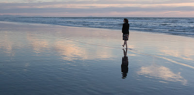 far less complex but essentially similar way to a delicious mound of steaming shit, and most dogs I know seem to view a roadkill with the same sense of appreciation and desire with which we humans view a limpid pool in a river on a sweltering day. How then might concepts like beauty exist independently from what perceives the beauty? To put it simply, is beauty only in the eye of the beholder?
And what causes me to see the world in the middle of this dry and hollow afternoon as dissonant and bruised? But if I somehow developed the ability to appreciate it all as beautiful, would I therefore have lost all ability to discriminate?
...
Colours and light. So often over these last few months I've been astonished and awed by the sheer power of the light. Elegiac light on distant mountains at dusk as the last sun breaks through rain cloud; evening sun on the hill behind the house, a hill so dry it's the yellow-grey colour of a lion, and behind it the deep blue-black of storm cloud. An angry sky, great clouds piled high into the evening, a thunderstorm in the South-West, black and green, its edges a luminous mist of rain. The car turns a bend in the road and ahead  the sun's shining through heavy rain, everything behind that glowing gradient of light obscured but in front, the gnarled shapes of old macrocarpas. Near Ohakea a squall drives rain against the windscreen, turns the tarmac into a welter of foaming water, but a minute later it's gone, just a few heavy drops spattering the car, the smell of rain rising from the hot asphalt. Wheat fields, waiting for the harvester, glow bright in drifting sunlight, brilliant against dark clouds. A small flock of finches rises then falls back into the crop, black motes against the ripe yellow. Further West, a more distant but much larger flock rises and swirls like an eddy of wind-stirred dust. They too disappear, down again into the wheat; the impression is more one of movement and grace than individual birds.
...
In October last year on The Online Photographer, Ctein [2] posted a short article about how the camera he happens to be holding influences the way he sees. If the camera's loaded with black and white film, he says, he “sees” black and white compositions; if it's colour film, the photographer in his mind finds colour photos. The article provoked a good discussion, mostly about whether anyone has ever proved equally adroit with both colour and black and white photography [3], but as I looked at the two photos Ctein used to illustrate his post, I realised neither he nor any of the commenters had mentioned what seemed to me to be an important distinction: that between seeing black and white and seeing in black and white.
Seeing black and white is akin to recognising when colour is unimportant, or at least secondary to other elements like form and movement. Seeing in black and white comprises recognising what something might look like if the colours were replaced by shades of grey. Ctein's photos showed snow chains on the tyre of a large vehicle. The first, a closeup, would have contained little or no colour; in effect, Ctein had seen the black and white composition, in the same way someone else might recognise the graphic possibilities of the shadow of a cat on a white wall (emphasising form) or a handful of shiny nuts and bolts on an old sack (emphasising tone and texture). The second photo, from further out, included the orange-yellow hub and part of the vehicle; this, I assume, he intended as an illustration of seeing colour.
However, the psychological processes are, I suspect, essentially the same: the facility with which one can switch between the two modes of seeing (colour/B&W) depends on one's ability to notice, to pay attention, and to recognise.
On the other hand, to see in black and white is mostly a matter of imagination. To look at a landscape, a street scene, or—much harder—a flock of brightly coloured parakeets and to be able to visualise what a photo of those subjects might look like in black and white differs hugely from the knack of knowing these would make lovely colour photos.
...
The sun rises through dense, early morning mist, a brilliant yellow-white disc hanging at the end of the long road. Ahead, a truck carrying a digger drives towards that sun through the luminous mist; silhouetted and angular, it looks like a sentient machine from an apocalyptic future. I try to look away from the sun, to lower my eyes from that burning disc, but the urge to gaze into it is almost overwhelming.
...
Seeing colour and recognising what might work in a photo, isn't as easy as sounds, particularly now we're bombarded with and have become accustomed to ultra-saturated images. Mike Johnston, primary author of The Online Photographer [4], said recently:
“It's often a source of wonder to me that color photography so infrequently uses color to any advantage—many viewers seem to prefer color simply for its verisimilitude—it shows what was, just because it was—without any thought to whether [...] the colors in a picture have any aesthetic affect or impact. Color can ruin pictures for me, as often as not.”I agree, although as a friend pointed out, most people photograph simply to record and remember, and for that, verisimilitude is a virtue. Still, I suspect Mike had in mind those who photograph because they enjoy photographing as a creative act, and in that context I share his surprise.
Accompanying Mike's post is a photo by David Goldfarb which beautifully illustrates the virtues of subtlety and restraint; to me it strongly resembles an old, hand coloured lantern slide. Thinking about colour and black and white, I grey-scaled the photo and discovered it produced a similarly beautiful black and white version. Whether the subtly coloured or black and white version could be considered better is a matter of personal preference. Again, this seems to me to be mostly about seeing colour—but in this case, seeing it when you have to look for it. In contrast, a photo which simply doesn't work nearly as well in black and white is Joel Meyerowitz's “Still life with newspaper”. Colour—restrained, even muted, colour—seems essential to this photo [5].
I thought again about Tony's assertion that I see in black and white. This I believe I understand—loosely put, it's the subconcious translation of colour into monochrome tones, and, as I've said, it differs from noticing (seeing) black and white. But what about seeing in colour? Can one make a similar distinction between seeing colour and seeing in colour—between noticing and translating? Or, because we're overwhelmingly confronted by colour, does the distinction disappear? If “seeing in” black and white is primarily a matter of imagination, what might we be imagining when the subject already presents in colour?
I suspect the process, for colour, amounts to imagining how particular hues might be accentuated, muted, or otherwise altered. The photos by David Goldfarb and Joel Meyerowitz appear to be the results of just such a process—neither photo seems “true to life” [6] but that's not what matters.  What does matter is that those photographers saw the potential for photos that express something other than, or in addition to, what might be evoked by more literal records.
...
Desiccated kelp litters Wharanui beach, flotsam strewn right across the beach and beyond the shingle dunes, wrack from a huge sea in the recent past. A flock of black-billed gulls battles into a headwind, making slow progress along the beach towards a cluster of juvenile black-backed gulls fossicking among the wrack or standing, hunched, facing into the wind. Near the ruins of a crayfish carapace and part of one spiny leg, a dead fish—red cod, I think—lies next to a torn-off kelp holdfast. The fish's empty eye sockets gape up at the sky; its open mouth, fine-toothed, seems fixed in its final gasp, drowned in air. A shard of paua shell gleams on the shining, salt-wet shingle. Wild sea, wind, birds in a vast blue sky streaked with white cloud. I look out over the chaotic, turbid surf to the empty horizon and imagine my gaze going on to Antarctica then further, into and beyond imagination. Suddenly, I understand that to call this beautiful or otherwise is meaningless. All I know is that living somewhere like this seems to be the most important thing in the world.
...
Of course, noticing and imagining aren't alternatives. All non-accidental photos require some degree of noticing by the photographer; this is an unavoidable consequence of the decision to point the camera at something in particular and to press the shutter at a particular moment. Similarly, it's hard to imagine anyone photographing anything while completely lacking any imagination about the outcome—the photo. I might be wrong about all of this, but it's been fun wondering about it and paying attention to what I'm doing when I'm looking at the world; noticing how I'm looking at it, what I'm seeing and imagining.
...
The wet shingle feels cold beneath my bare feet. I return to the car and resume my journey, on to Blenheim, then Picton and the ferry. Somewhere in Cook Strait I look up at the sky, to where a lone, white cloud hangs in an aquamarine sky. Stretching from the cloud, a faint trace of shadow darkens the blue, so subtle it seems to vanish under a direct gaze; it can be seen only by looking off to the side. Perhaps that's the case with most things subtle—the trick is to pay enough attention, but not too much. And perhaps I've paid too much attention to this topic and lost sight of what I thought I was seeing. So, I'm going outside, partly to look at the colours of the world but mostly to enjoy it. I suggest, if you can, you do likewise.
Notes:
1. Haliotis spp. (the Maori name paua usually refers to H. iris)
2. Apparently, Ctein is pronounced “Kuh-tine”, and it's his full name. From what I can gather, nothing about him could be described as ordinary; "larger than life" might be more apt.
3. According to some of the commenters on Ctein's post, examples of photographers who have proved themselves adept at colour and black and white include Harry Callahan (the photographer, not the other one), William Klein, and Sylvia Plachy.
4. I recommend The Online Photographer as one of the best photography oriented blogs. Sure, like all of them, it has plenty of opinion, but it's generally well-argued (and well written); it's a good source of news and ideas; and many of the articles I find excellent for learning about photographers I knew little or nothing about.
5. The online version doesn't do it justice, at least not compared to the version I've seen printed in Geoff Dyer's magnificent book, The Ongoing Moment — and the plates in that book appear no more than adequate to illustrate Dyer's assertions.
6. Of course, a “true to life” photo—one that substantially achieves verisimilitude—is unattainable, as yet another recent T.O.P post suggests.
Photos (click to enlarge them):
1. Three elements on a long coast.
2. Gull and tern, loc. cit. I find it difficult to imagine most wildlife photos in black and white.
3. Evening at Himatangi Beach, Manawatu, a few weeks ago.
4. Some subjects seem to cry out for black and white. Colour can often distract rather than complement.
5. My driveway at dusk.
6. Macchapuchare and the entrance to the Annapurna Sanctuary, Nepal. March 2007.
7. Farmer at Kileswar, Gujarat, India. Early 2007.
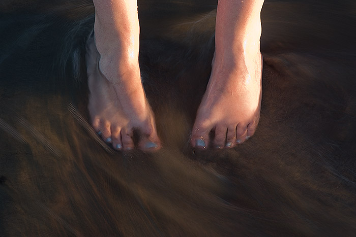
8. Not my feet, on Himatangi beach. The beach here contains some ironsand, hence the dark colour.
[Update (8 May 2008): Mike has posted another thoughtful—and controversial—discussion about colour vs B&W on T.O.P. The comments so far are notable mostly for disagreeing with his assessment of the use of colour in a photo by Udayan Behera. I'm inclined to agree with the disagreement, but don't let that put you off reading and thinking about what Mike has to say. In particular, try applying his suggestion of blurring a photo to help assess whether its colours "work" (or just remove your glasses).]
Photos and words © 2008 Pete McGregor
